Why Is Contrast An Important Aspect Of Web Page Design?

Chad Faith
Director of Content
In web design, contrast plays a pivotal role in shaping the user experience. It influences the readability of text, the visibility of elements, and your site’s overall aesthetic. Without proper contrast, your website may become difficult to navigate, and key information could be overlooked. This highlights exactly why is contrast an important aspect of web page design?
Understanding why contrast is an important aspect of web page design allows designers to create more accessible, engaging, and visually appealing sites. Here, we explore the significance of contrast and how it can elevate a website’s performance.
How Contrast Affects Readability and User Experience
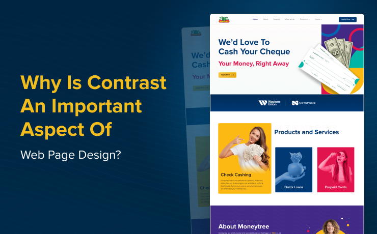
One of the most important reasons to focus on contrast in web design is its impact on readability. Text that blends into the background can be difficult to read, especially on smaller screens or in low-light settings. For example, light grey text on a white background may be barely visible to users. Conversely, strong contrast, such as black text on a white background, makes the text clear and easy to read.
The Web Content Accessibility Guidelines (WCAG) suggest a contrast ratio of at least 4.5:1 for normal text and 3:1 for large text. Following these standards not only improves accessibility for people with visual impairments but also enhances the overall usability of your website. By optimizing color contrast, you create a better user experience, which leads to longer engagement and more satisfied visitors.
The Role of Contrast in Visual Hierarchy
Contrast is also instrumental in establishing a clear visual hierarchy. It directs attention to the most important elements on a page. For example, using contrasting colors for headings, buttons, or call-to-action (CTA) elements ensures that users know where to focus their attention. When users first land on a website, their eyes naturally gravitate toward the areas with the most contrast. This helps guide them through the site and encourages interaction.
Color contrast can also help break up large blocks of text and make complex information easier to digest. It highlights key sections and makes the content more visually appealing, reducing cognitive load and improving user comprehension.
Color Contrast in Web Design: Practical Tips
Achieving effective color contrast is not just about picking colors with high contrast but also strategically using them. Here are some ways to use color contrast in web design effectively:
- Complementary Colors: Use opposite colors on the color wheel (like blue and orange) to create a striking contrast. Complementary colors can make certain elements, such as buttons or links, stand out and grab users’ attention.
- Analogous Colors: These are colors next to each other on the color wheel, such as blue and green. Using analogous colors in combination with darker shades can create a subtle but pleasant contrast that is easy on the eyes.
- Light and Dark Elements: For maximum contrast, use light colors for text on dark backgrounds or vice versa. This creates a clear separation between the text and the background, improving readability and focus.
- Avoid Overuse of Bright Colors: Bright colors can be overwhelming when used excessively. Balance them with neutral tones like grey, black, or white to create a more harmonious and accessible design.
Let SmartSites Help You Perfect Your Web Design
At SmartSites, we specialize in creating high-impact web design that is not only visually appealing but also accessible and user-friendly. By focusing on color contrast, we can make your website more engaging and easier to navigate.
If you are looking to improve your website’s performance, our team can assist with custom development to create a seamless user experience.
 Free
Consultation
Free
Consultation Free
Google Ads Audit
Free
Google Ads Audit