What’s Trending In Logo Design Now?

Chad Faith
Director of Content
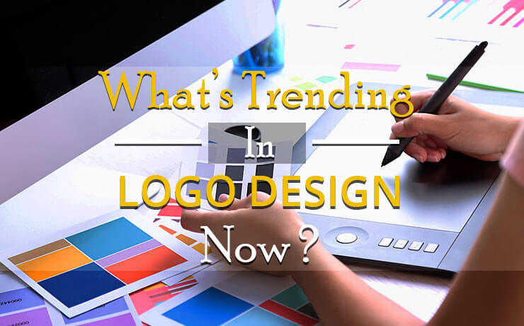
The design scene is constantly evolving and is incorporating new styles and trends on a regular basis. The logo design industry is one of the parties that have been affected by such changes. Since logo designing is an integral part of website design, it’s imperative that you keep up with these changes. Let’s take a look at some of the popular trends that have been dominating the scene in 2017.
Use of Negative Space
As you already know, design is what you see. You will be able to understand the message of design, once it starts talking to you. With that in mind, the full potential of negative space has yet to be unlocked. That’s why logo designers continue to experiment with negative space to gain a deeper understanding of this remarkable design technique. To stand out from the crowd, you must make sure your logo must be more than meets the eye.
Rise of Hand-Made Logos
Logos that mimic hand-made elements and images are expected to remain trendy in 2017. What’s great about hand-made logos? For starters, they enable the creation of a wide spectrum of visual effects, including children’s images, grunge, vintage, and more. If you want your images to possess 100% uniqueness and gain wide brand recognition, this is one of the ways to go.
Text Logos (Classic and Framed)
By looking at the logo evolutions of well-known brands like IBM, Coca-Cola, Sony, etc., you can see that classic text logos still remain an effective and relevant tool, even in 2017. Speaking of 2017, you can expect to see more framed text logos this year. Messages will be placed inside a frame (rectangular, circular, triangular, etc.), which is designed to draw the customers’ attention to the text part of the logo design. Who knew such a simple (yet smart) could go a long way whilst creating a visually appealing icon.
Simple Geometric Shapes
Sure, geometric themes have been around for some time but basic geometric shapes are making a comeback and are going to be the highlight of 2017. If you ever wanted to create unique and stylish logos effortlessly, using geometric shapes is definitely one of the ways to do it!
Overlapped Gradients
Overlapping gradients is a relatively new logo design technique that has gained recognition among the world’s leading companies, including MasterCard. Don’t be surprised when you discover that it has every chance of becoming a trending design technique in 2017. This is happening because simplistic trends are on the rise, and simplicity is what defines gradients today. With that in mind, it’s useful to note that designers are achieving this goal by utilizing material design colors and muted hues.
Classic Black and White Logos
Color palettes have always been a powerful tool used by designers. That’s why it’s pretty unconventional to stick to just two colors, which are black and white. However, black and white are becoming the two dominant colors, and more designers are exploring this new trend to create unique graphic solutions. Looking for an alternative to using bright colors? This is it.
Stencil Typography and Line Art
Stencil designs and their fonts are known to come in a wide array of sizes and forms. What’s more, they can be used to create visually stunning logos. With that said, it’s unlikely that designers will omit the use of versatile stencil patterns this year. In addition, designers love line art because they are considered as a daring minimalist technique that can bring images and texts together flawlessly.
 Free
Consultation
 Free
Google Ads Audit
