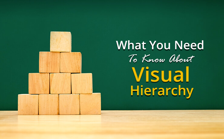
What You Need To Know About Visual Hierarchy

Clement Foo
Senior Digital Content Manager

Today, millions, if not billions of individuals tend to rely on the Internet as their first sources of information. Due to the sheer number of people going online daily, websites are in a constant and fierce competition for traffic. Oftentimes, website owners strive to remain at the top by developing cut-edge marketing strategies, producing quality content, or by using a cutting-edge website design. Although content is still the king, one should not forget that humans are visual beings as well. If the content is featured on a poorly designed website, the business owner may fail to capture his or her audience’s attention. That’s why maintaining good visual hierarchy is important. It is the order in which a viewer processes information on a page.
Visual hierarchy’s function in user interface (UI) design is to help visitors understand information as easily as possible. By assigning certain visual characteristics to sections of information, designers can influence what visitors perceive as the “top” elements of the hierarchy.
Color and Contrast
Although colors can differentiate areas of information with great effect, they need to be used with caution. Using too many colors in a certain area can make a design appear cluttered. In addition, using the wrong colors may create a weak visual impact. With that in mind, utilize color theory when mixing and matching colors so that they can portray the correct meanings you have in mind. With the right colors in place, one can accentuate important information, such as links to upcoming events, latest products/services, and breaking news.
Now that you have a basic understanding of colors, it is also important to know a thing or two about contrast. For example, bright colors tend to stand out from grayscale or muted colors. Lighter tints, on the other hand, may appear more distant and fall lower on the hierarchy than their darker and richer counterparts.
Proximity
The principle of proximity involves grouping related items visually to create less clutter and achieve a more organized layout. This also means that unrelated items will be placed further apart to emphasize their lack of relationship. White space plays a huge role in proximity as they tend to affect the user’s behavior as much (if not more) as the actual content on the page. If used correctly, white spaces can guide the users’ eyes in the intended direction, establish contrast, and make a lasting impression.
Scale
One of the most effective tools for establishing visual hierarchy is scale. It can effectively guide a viewer’s eyes to a specific element of the design. Oftentimes, larger objects grab more attention than their smaller counterparts. In addition, the human mind tends to associate size with importance. This means that the larger elements on the page or design will hold more importance than others.
Alignment
Designers and website owners can create continuity between elements via the rules of alignment. For example, elements that are aligned along a diagonal plane, to the right, or to the left appear to be more related. This happens because the human eye unconsciously follows and recognizes lines. So, if you wish to connect certain areas of information visually, it is important to create visual lines in the design.
There you go, establishing visual hierarchy can help make designs appear more aesthetically appealing and organized, as well as improve information design. Most importantly, creating visual hierarchy isn’t difficult if one follows these basic rules… as shown above!
 Free
Consultation
 Free
Google Ads Audit


