Web Design Tricks: How To Attract Attention

Chad Faith
Director of Content
When creating a website design, it’s crucial not just to think about whether or not it looks good. Even more important, is thinking about the way your web design impacts the visitor. In other words, how does it affect the way your visitors navigate your site or the way they interact with it. It’s critical to think about your website not just as a page, but also as a flow of information.
This means you need to think about which part of your design is going to jump out first, where the visitor is going to ‘end up’ after they’ve seen everything and what is going to stand out the most. This can make all the difference when it comes to their experience of your page, as well their first impressions, the next ‘action’ they take and ultimately the effectiveness of your design. This means understanding the psychology of attention.
The Basics
When it comes to leading the viewers’ eyes, it pays to think first about the basic rules of any layout. For instance, it’s a given that viewers (Western viewers at least) will consume information from the left to right and top to bottom. This is the way we read and thus we have years of experience making us absorb information in that way.
We also pay special attention to the middle of a page when it first loads up which gives us the best ‘big picture’ – so in some circumstances this can also be a good ‘starting point’ for your flow of information, except that it leaves you with nowhere to go.
But there are other factors at play too. Consider the fact that we also tend to look at what’s boldest (or highest contrast) and what’s biggest first. Make the second element bigger and bolder than the first and your visitor will possibly see that initially instead. Ideally, the thing you want people to see first, should at once be the highest, the furthest left and the boldest. Otherwise your content may be sending mixed messages. Moving elements also tend to attract our attention.
This video explains the topic well.
Be careful with your implementation of advertising, as this can sometimes steal attention away from where you would like it.
Cues
This is a problem in web design potentially if you want to have multiple items of equal size, or if you want to put your most important elements somewhere else on the page. In that case, you can try using a simple cue such as an arrow in order to indicate the intended flow of your content.
The Role of Images
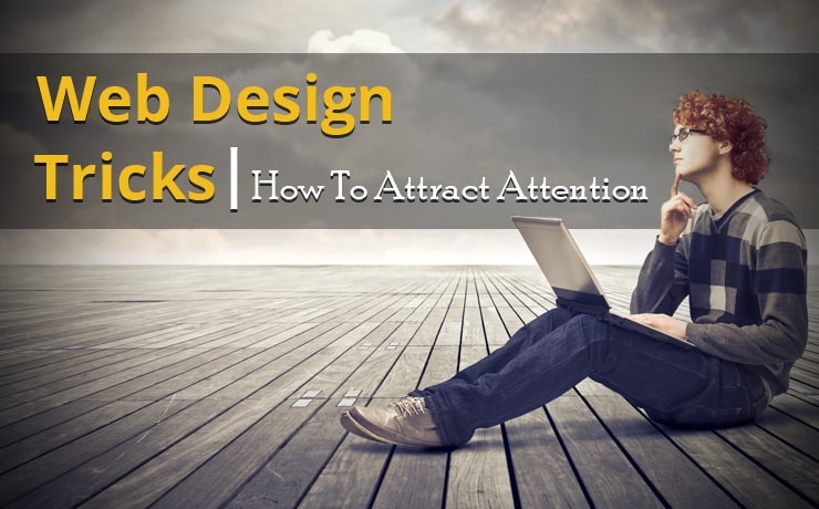
Sometimes, we use cues without realizing it. Whether or not you intend them to act that way, almost every image will provide a cue as to what we should be looking at first. If there is a person in your image for instance, then that person should always face the content you want your viewers to look at first. The reason for this is that we unconsciously see this as a cue to what’s important – almost the same as an arrow.
You can also look for ‘accidental arrows’ within your images. An arm for example, or even the branch of a tree, can nicely point at what it is you want your visitors to look at and thereby highlight it.
You can’t just ‘dump’ images in your content, you need to think about how they are affecting attention.
Conclusion
It’s impossible to know where your visitors are looking when they visit your site, but using heat maps provided by tools like Crazy Eggs you can see where they click – and the two will often correlate.
In short, make sure to consider the way you direct your visitors’ attention when they visit your site and to ensure that every element on your page clearly indicates where they should be looking.
 Free
Consultation
Free
Consultation Free
Google Ads Audit
Free
Google Ads Audit