Web Design Matters: Why You Should Care About Millennial Branding

Chad Faith
Director of Content
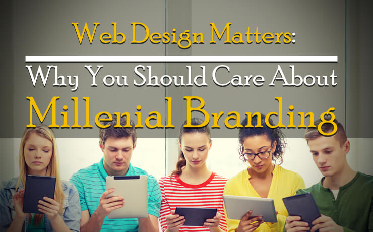
It’s no surprise that we are living in an age of information saturation; almost everything that we want or need to know is at our fingertips. What’s more, owning a smartphone has become a norm today and studies have shown that smartphone users tend to check their devices more than 80 times a day. That’s why the demand for responsive website designs continues to rise. Speaking of website designs and branding, your logo is one of the most powerful marketing tools. If the logo design complements the look of the website, you can create lasting impression in your visitors.
However, when it comes to logo design, an increasing number of individuals want simplicity back instead of complex. They prefer having designs that can cut through the noise of millennial living. Some may associate minimalism with things are callous or cold but it does not always have to be the case. If simple designs are used correctly, they can articulate important parts of a brand’s message with ease. Let’s take a look at how logos in your website design should be fine-tuned to meet the growing needs of millennial branding.
Bar Elements
Seek rhythm in something to create meaning in the chaos. Ever heard of that? You should note that web users tend to engage with designs that incorporate rhythm well. With that in mind, you can try creating logos that incorporate elements such as pattern bars. Do it correctly and the rectangular shapes of your bar logos will complement the solid structure of your organization.
Line Art Elements
Line art first became popular in 2015 but it is still used today. Monoline designs, for example, appear playful in nature as they probably echo days of childhood drawings. Monolines usually feature one solid line throughout the logo. Today’s version is slightly different as it has evolved into line dash design. If you plan to use line art in your logos, be sure not to reduce the visible detail when you scale your designs.
Corner Elements
For starters, the psychology of shapes is powerful. Shapes can be used to influence audiences’ feelings. For example, rectangles and squares can represent inner tranquility. Today, right angles are making a return. This is thanks to the high demand for simplicity. If you incorporate corner design elements in your logos, you can use those elements to symbolize the unity of your organization or express unique messages from your brand.
Ombré Elements
While traditional color gradients are still used in logos, stepped color increments are definitely the in-thing now. In the past, a gentle path is often formed from point A to point B. Next, the goal was to make the colors flow from one color to the next as naturally as possible. Ombré logo designs, on the other hand, allow for pattern and texture to be introduced to the design and help define edges.
User-Friendly Typography
Today, users do interact with more than one screen; laptops, desktops, smartphones, etc. That’s why you want your logos to be scalable and look great on any platform they’re viewed on. Google’s logo revamp is a perfect example that’s suited for millennial branding. They modernized their typography-based logo to a sans-serif font.
Keep in mind that millennial consumers prefer to look at inspiring designs and logos that can cut through the clatter of 21st century. Experiment with the design elements discussed above to communicate your brand’s message in your website clearly!
 Free
Consultation
Free
Consultation Free
Google Ads Audit
Free
Google Ads Audit