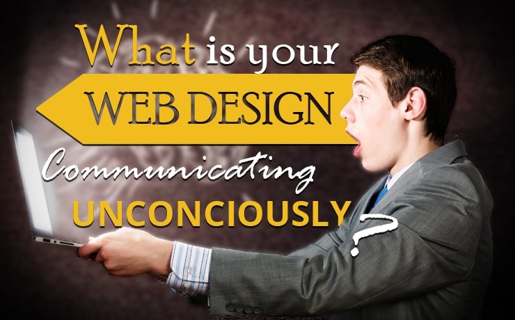
What Is Your Web Design Communicating Unconsciously?

Chad Faith
Director of Content
By and large, good web design is communication. That is to say, that everything you include on the page when coming up with a layout for a website or an advertisement, should be chosen in order to convey a message or an idea. In fact, a popular mantra among web designers is ‘communicate, don’t decorate’; which is to say that any element not contributing to the message would be better off being removed entirely. Here’s an in-depth guide to ‘visual grammar’ if you want to learn more about that.
But what you have to understand is that communication isn’t a choice. If you create any visual element, then it will be communicating something – whether you meant for it to or not. Even if you intended your design choices to communicate one message, you may in fact find that they communicate something else as well or instead on an almost unconscious level. Read on and we’ll look at how that can happen and how to make sure your site is saying exactly what you want it to.
What Your Site is Communicating Unconsciously
Attention
When you load up a new website, you feel as though you know where to look without consciously deciding how to look around the page. This is partly as a result of our expectations (we read left to right, top to bottom), but also as a result of cues on the page. Intentionally or not, your choice of colors and positioning will instruct viewers on where they should be looking. The question is: are you orienting them in the right way? Are you giving importance to the most important elements?
Something as simple as an arrow, or even a triangle used as an arrow, can completely change the ‘flow’ of information on your page. See this helpful video for more on attracting the viewer’s attention.
Associations
One thing you have to be wary of is that what gets communicated will almost always be somewhat subjective. That is to say that what one person sees when looking at your site, may be slightly different from what another person sees.
This is due to the associations that a person has and that they bring with them when consuming any content. Most of us associate the color green with environmentalism and nature for instance, but someone else might associate the color more with technology (think old-school computers) or with money. Other people might have entirely strange associations that lead to your design making them feel uneasy – even if they can’t put their finger on why.
Your job then is to try and leverage the associations that will ring true for the greatest number of people (and for your target audience) and the more ‘objective’ associations, while also being weary of some of the unintentional connections some people might draw.
Here’s some information on color psychology as it applies to logo design. Here’s another useful infographic.
Behind the Scenes
When we consume any design or content, we will not only judge the content on its own merit, but we will also make some assumptions about the work that went into it and the person who made it.
So if you look at a website that is badly made, that will communicate something to you about the organization behind it. On the contrary, a site that shows great attention to detail will make you look like a company that cares and that’s highly capable. What does your site say about you?
People will also second guess your site in terms of what they think you want them to think about you. They’ll see what you’re trying to say, but at the same time be drawing their own conclusions. You need to hope that these two messages concur to avoid losing trust.
 Free
Consultation
Free
Consultation Free
Google Ads Audit
Free
Google Ads Audit