Top Tips For Making Your Photography Website Stand Out

Chad Faith
Director of Content
For photographers, designing and developing websites may be the single most important part of building and maintaining their brands and identities. This online portal has the ability to define how their potential commercial clients see them and determine if they should contact them for a quote. While photographers are often amazing at creating compelling images, these particular skills do not necessary translate into web design talent. If you are a photographer and want to create an effective and attractive commercial photography website that stands out, you have come to the right place. Check out the tips below!
Add Meaning to Your “About Us” Page
About Us pages should be useful to clients and not be used to feature long, personal anecdotes. Oftentimes, visitors and potential clients are not interested in finding out what equipment you use or who your idols and inspirations are. These visitors may just want to know what you are good at, your level of experience, as well as testimonials/reviews (to know what it’s like working with you).
With that in mind, focus on summarizing your photographic and specialty, and provide an explanation on why your services are a good fit for the client’s needs. One should, however, do this without getting too sentimental or wordy.
Showcase Your Best Works
Some photographers tend to make the mistake of showcasing sub-par work without realizing it. Perhaps that landscape shot required seven hours of preparation or you had an emotional connection with a portrait. Unfortunately, if these things do not translate into high-quality images, clients may not care. Because it is almost impossible to share the personal connection one has with a certain image, featured images must be able to stand on their own as one’s very best works.
Instead of being a jack-of-all-trades generalist or be tempted to show as much work as possible, this should be avoided as it may dilute your specialty. It may make it difficult for potential clients to understand what you are good at.
Increase Visibility of Contact Information
Although featuring one’s contact information on the About Us page is good, it is often not enough. The goal is to prevent visitors from having to think about where to find your contact information. That’s why it is important to make this piece of information blindingly obvious. For example, photographers can create a dedicated Contact Me page and add a Contact link to the main navigation bar. When a visitor clicks through the page, he or she should be presented with a professional email address (e.g., name@yourcompanyname.com), physical studio/office address, and phone number.
Stick with a Theme that Best Represents You
Regardless of who visits the website, you want them to understand your strengths as quickly as possible. For example, if one specializes in sports, his or her photos should contain professional shots of past or recent sporting events. Not a random mixed of reportage, sport, architecture, and food.
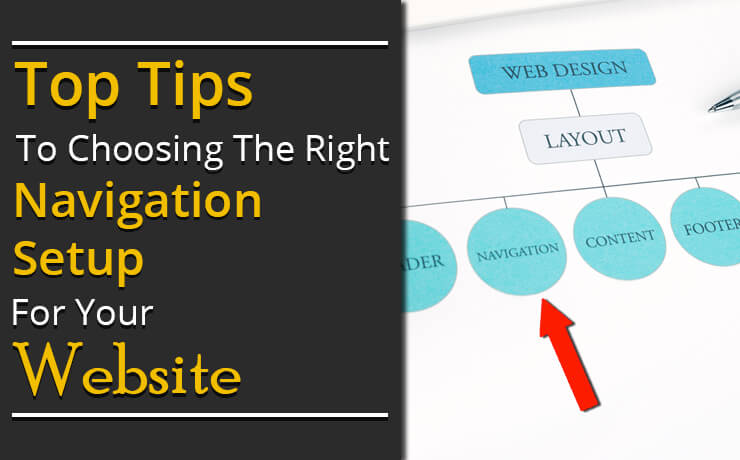
Simplify Navigation for Potential Clients and Visitors
Always consider your visitors’ and clients’ needs first because these individuals may not have a lot of time to review your work. This means featuring large images, implement an easy web navigation layout, and include information that quickly answers as many of their queries as possible. Instead of using slow image transitions, one’s gallery should have the option of manual navigation so that visitors can browse through it faster. Another good practice is to upload images that are large enough to show detail but are small enough to load quickly. Speaking of which, elements such as fancy animations, splash pages, and loading bars may slow down the site, so consider avoiding them.
 Free
Consultation
Free
Consultation Free
Google Ads Audit
Free
Google Ads Audit