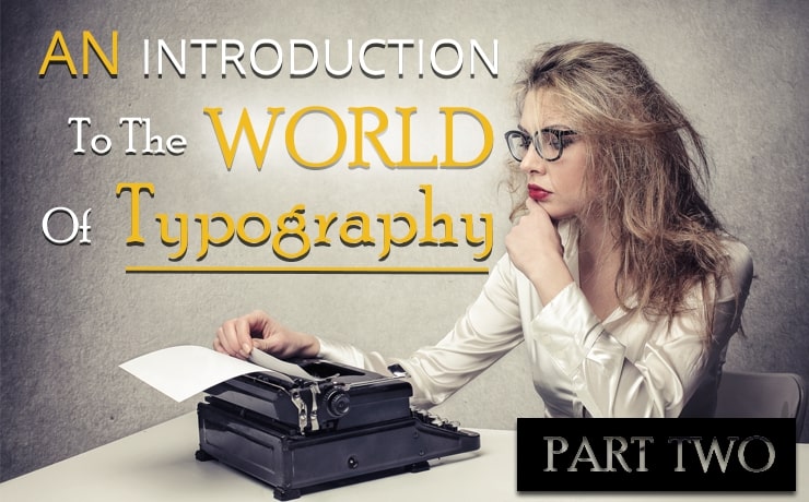
An Introduction to the World of Typography | Part Two

Chad Faith
Director of Content
Last time, we took an in-depth look at why typeface matters and how to pick one for your site. If only it were so simple! Read on and we’ll examine how and why to use multiple typefaces and where you can find your own fonts.
Mixing Fonts and Typefaces
You should not think that the job of picking a typeface boils down to simply finding one you like that’s easy to read and then using that throughout your site. Well, thinking about your typeface means using more than one font and choosing a combination that works well together. This will not only elevate your design even further, but it will also give you the ability to make headings, subheadings and other points of interest really stand out.
Before we get started, first it pays to know the difference between fonts and typefaces. Well, fonts (which come from ‘fount’ – as in ‘fountain pen’) are categories of individual typefaces that have similar characteristics. So if you take Gotham as a font, there are then multiple typefaces that fall into that category, including ‘Gotham Light’, ‘Gotham Book’, ‘Gotham Medium Italic’ and etc.
The trick here is to choose fonts and typefaces that are different enough to create a real contrast. This infographic can help you to find good font combinations, but the general take-home message is that using two very similar fonts is a no-no (though using different weights of typefaces from within the same font-family is fine). You should also choose font combinations that are similar in ‘mood’ and era (so no combining a gothic typeface with Impact).
Two is the ideal number of fonts for your site, but you can stretch that to three if you like. Try and be unique with your font combination: if you do this well then you can avoid your site looking identical in typeface to any other on the net.
The idea is to combine flavors almost as you would when cooking, but not to overcrowd your site and make it look to busy. Again the cooking analogy applies: certain herbs work with certain dishes and not others, but throwing in every seasoning you like the sounds of will just make an inedible mess.
When should You Combine Typefaces?
So now you’ll have selected two or three typefaces to work with, and you’ll also be able to choose different weights from within those font families, different sizes and different colors. On a most basic level, you can use your ‘secondary’ fonts to denote headings (fonts like Egyptian with thick serifs and lines).
But if you want to be even more creative, you can try using different fonts, weights or colors within a single passage of text. We do this all the time when we use italics (originally designed to fit more words on the page) to denote emphasis. How might your heading look if only one of the words was in a heavy font? Or if that word were larger? Or if you had a red question mark? Here’s a great video that asks (and answers) exactly those questions.
This conversation leads into the discussion of ‘ergodic text’, which we don’t have room for here, but if you’re interested follow the link to see how typefaces and the web was once predicted to change the way we read and write forever…
And we haven’t even discussed spacing or line height yet! It will suffice to say that larger line spacing (1.3 pixels+) can help to make your content more legible but going too far can risk making your pages look almost childish. Spacing will also be impacted by the choice of typeface, as a less legible typeface might benefit from more spacing (and different typefaces will also be designed in such a way as to take up either more or less of the line).
Where to Find a Typeface
Hopefully, all this talk of typography has left you itching to start experimenting with bold new designs. If that’s the case, you might be wondering where you can find your own fonts. A great place to start would be FontSquirrel.com which has a ton of free resources. Otherwise you could try one of several popular font builders like this one, or you could hire a designer to build you one.
Either way, as long as you’re starting to think about typography for your web design, you are one step ahead of the competition.
 Free
Consultation
Free
Consultation Free
Google Ads Audit
Free
Google Ads Audit