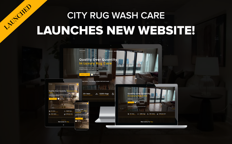
Nearly 60 percent of all e-commerce traffic happens through mobile devices. Today, more than half of all visitors and customers browse through online shopping websites through their tablets, smartphones, and more. That’s why retailers need to get engaging and responsive mobile websites. This is, however, just a start as one should also optimize their sites’ mobile design elements to help drive more sales. Here are five of them:
HTML5 Compatible Elements
Modern e-commerce websites should have HTML5 compatible design elements if they need to host any videos such as product demonstrations from their YouTube account. One should avoid flash as it is an outdated format on many devices, including desktop computers and mobile devices. In addition, it loads slowly, consumes resources, and can be used as a point of entry by hackers.
Readable Fonts
Pinching is a common technique used on mobile devices to enlarge images and text. Today, all fonts should be readable without the zoom-in effect. In addition, a link should be clickable without the pinching action. If the mobile version of your e-commerce website is a copy of the desktop design, you need to revamp your mobile design. Ideally, every design element should be proportional to the mobile device’s screen.
Start thinking along the lines of large, bold, and simple fonts. Sans Serif fonts such as Arial, Helvetica and Tahoma are clean and simple. When changing fonts, it is also a good time to improve your copy so that you do not need to use too many words to convey a message, i.e., make it short and snappy.
Company Logo Home Buttons
When a visitor or customer has clicked through multiple pages on your e-commerce site, they are now several layers deep. The website should offer an easy way to return to the homepage; reset and go back to the start. Let’s say that a customer is looking at a certain product page, and he or she now wants to start over. The large company logo design that’s centered on the top can be the link to the homepage.
Minimalist Designs
Working with small screens can be challenging, especially for e-commerce sites that need to squeeze a lot of content in one place. Simply stick with simple design elements to promote your products so that they do not clutter the limited screen space. In addition to simplicity, the site must have a cohesive feel after the design elements are added.
Hamburger Menus
Hamburger navigation menus are a popular design trend. This design element is easily noticeable; the icon with three lines stacked on top of each other. When a visitor clicks on it, the full navigation menu expands. Today, a traditional header navigation menu can clutter the screen. Modern menu design elements should be easy to tap, obvious, tidy, and stay out of the way in a user’s viewport. Mobile device usage is now dominating the online shopping market. Online retailers cannot take the risk of treating mobile website design as an afterthought. By using the correct mobile design elements, one can stay one step ahead of the competition and capitalize on bigger flows of traffic.
 Free
Consultation
 Free
Google Ads Audit


