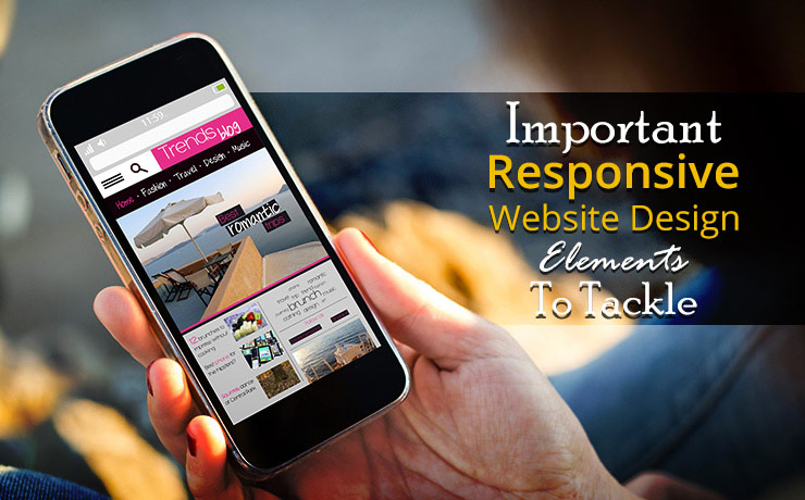
Important Responsive Website Design Elements To Tackle

Chad Faith
Director of Content

It is important for all business owners to design and develop websites that respond efficiently to their users’ demands. In addition, one’s site should be able to adapt to their viewers’ preferred platforms, screen orientation, and sizes without any form of hard coding. With the use of flexible layouts and grids, your website should automatically adjust according to the devices that your visitors use, e.g., tablets, laptops or smartphones. Read on to find out more about the different responsive website design elements to tackle.
Optimized Images
Images on websites must automatically adjust based on the device being used to view the site. A good practice is to set a maximum size so that the images can load in their original sizes unless they are too big to fit in a particular display. If a certain image can’t fit, then the responsive website will automatically scale down the image without causing it to become distorted. Make sure that you use the correct image resolutions as some devices may take a long time to load high-res photos.
CSS3 Media Queries
These media queries allow website owners to customize the presentation of their web pages for a wide array of devices, including desktops, laptops, tablets, phones, etc., without making significant changes to the markups. A media query typically consists of expressions and media types that match the conditions of a device’s screen resolution, width, and other media features.
Since media queries are recognized as logical expressions, it can be resolved to either false or true. For example, a media query is true when a specified media type matches the type of device the content is being displayed on. In this case, related style rules and sheets are applied to the target device.
To offer the best viewing experiences on different devices, one can use CSS3 media queries to alter the web page width and other related elements. Alternatively, you can use these queries to create multi-column website layouts for more responsiveness and adaptability.
Automated Screen Resolution Adjustments
The positions of a web page’s elements differ from device to device. It is important for these elements to automatically adjust according to the current screen resolution. The page should be able to take on either a portrait or landscape aspect; switch from between one to the next and back again. A site must be carefully planned and mapped before it can be put together. Having a roadmap allows business owners to implement the correct layouts, grids, and other fluid elements such as images.
A responsive website design is a must-have asset these days. If you are planning to design a business website, it is important to have the tools and knowledge to build from trusted platforms such as WordPress. At SmartSites, we have years of experience in designing and developing user-friendly responsive websites that are easy to access via a wide variety of devices. Most importantly, our team takes future utility into account. Feel free to contact us to learn more about our online marketing services today.
 Free
Consultation
 Free
Google Ads Audit


