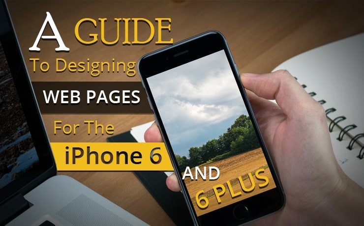
A Guide To Designing Web Pages For The iPhone 6 And 6 Plus

Chad Faith
Director of Content
Apple lovers around the world have rejoiced at the launch of the new iPhone 6 and its brother, the iPhone 6+. Both these phones are unique among iPhones in that they offer large screen sizes akin to modern Android phones. This is something that Apple had previously insisted they would never do, but it’s great news for all those Apple lovers who were starting to get eyestrain while trying to browse their favorite websites.
And as you might expect from any new iPhone, sales have been phenomenal and that’s even in the face of the #bendgate controversy. For web designers, this means that there’s now a new, highly popular device that countless people will be viewing sites on. This in turn means it’s crucial that designs be fit for those new specifications unless they want to lose potential visitors.
Here we will look at how you can ensure your site design is ready for the new iPhones and at the same time ensure it’s ready for any new devices that might come along in future.
Responsive Design
The single most important way to ensure that your web pages are ready for any new device is to use a responsive design. This means it should change size and layout in order to ‘fit’ whatever display it’s being viewed on. There’s a lot of information out there on responsive design, but generally it means using percentages instead of set widths and heights, it means having flexible images, it means using media queries and it means choosing design elements that will look good at multiple different sizes.
Testing
While a good responsive design should be able to adapt naturally to different sized displays of any kind, you can’t be sure that it will look good on a new device until you actually test it yourself. If you own a website, you should try to get into the habit of asking everyone you meet if you can test your site on their phones, their computers and any other devices they have.
Fortunately, if you don’t know anyone who owns an iPhone 6, you can still test the way your site will look by using various online tools. One good example is www.viewlike.us. This site will let you view your pages in various resolutions and dimensions, and includes a number of in-built specifications for popular devices (though the iPhone 6 and 6 plus aren’t in there yet). However, viewlike.us doesn’t change the user agent so if a website that doesn’t has responsive design but has their own separate mobile website, it won’t be shown on viewlike.us.
Flat UI
Ultimately, if you have done your responsive design well, you should feel fairly confident your site will look good on the new iPhone 6 – especially as there are various Android devices of similar specifications.
If you want to go one step further though, then you can also try designing your site using design principles consistent with iOS 8. This would mean using flat UI elements, touch friendly controls and plenty of transparencies. This way your site will feel ‘natural’ for viewing on the iPhone, and seeing as iOS tends to influence wider design trends across the net, it will probably help to keep your site looking modern and relevant as well. See Apple’s own guidelines for ‘designing for iOS’ for help.
You can also look at the following infographic for more inspiration:

 Free
Consultation
Free
Consultation Free
Google Ads Audit
Free
Google Ads Audit


