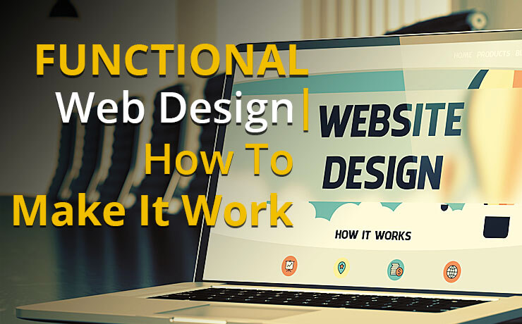
Functional Web Design | How To Make It Work

Chad Faith
Director of Content
To kick off this post, we would like to quote Steve Jobs – “design is how it works.” You wouldn’t want to just treat design as something that just looks like something. When it comes to functional web design, it’s important to note that form and function are much like two sides of the same coin. Let’s find out how you can succeed in creating functional web designs for your upcoming web design and development projects.
Don’t Get Distracted by “Shiny” Web Design Themes
A majority of commercial WordPress themes are often pre-loaded with elements such as parallax scroll effects, animated progress bars, pricing tables, portfolio pages, sliders, and more. Ask yourself, do you really need all of them? Do you know what your site actually needs to communicate the intended message to your audience? In most cases, it is none of these bells and whistles. That’s why it isn’t really worth getting distracted by the shiny. If the theme doesn’t work for your users, it’s not a great design to begin with.
Great Web Designs Often Begin with Your Content
Quality content creation is an important to-do item in anyone’s “launch a website” list. What’s more, writing your own web content can be a rewarding exercise. Simply communicate what you do and what drives you to do it. The process of streamlining and clarifying your message, pricing and service offerings help you decide what parts of your business you want to focus on and develop.
It’s imperative that you craft an authentic voice for both your business and your website. You will be able to distinguish yourself much more easily. Keep in mind that your content is the building blocks for making stellar design decisions. When it comes time to design and develop your site, the effort you put into initial content preparation will pay off.
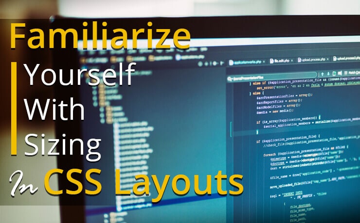
Pay Attention to Web Accessibility and Responsive Web Design
After creating all the content your site needs, you must make sure they are accessible to everyone. Yes, your content must be usable across multiple devices. Below are a few simple practices to keep in mind:
Keep your animations short and sweet
Motion sensitivity must be considered when creating animated events. You should keep them short and include user controls to enhance the effectiveness of your web animations.
Make your site viewable to people with color-blindness
Red-Green Color Blindness and Deuteranopia are some of the most common color blindness conditions. With that in mind, you wouldn’t want to make the mistake of including too much red and green; they are often indistinguishable.
Use headings appropriately
Always remember to break up your content and introduce new topics. Do this by using H1-H3 headings appropriately (see how we did it in this post). Your readers will find that it’s easier to scan your content and located specific parts that they are interested in.
Ensure that there’s excellent contrast between page background and text
It’s true that many people fancy the concept of minimalism. However, a faint dove-grey text on a glacier white background isn’t going to work out well. In addition, never go below 10pt for your fonts. On mobile devices, make sure that all fonts are readable and you leave adequately sized tap targets.
 Free
Consultation
Free
Consultation Free
Google Ads Audit
Free
Google Ads Audit


