Effective Logo Design Tips For Photography Websites

Chad Faith
Director of Content
An effective business logo design is very important in the online world. That being said, it is even more important when you are part of a creative industry such as photography. Oftentimes, when you set up a website, you are doing it to market your business. Your website is a major online graphical representation of your business and using the right logo can help tie together your entire brand and ensure your target market perceives your photography business in the way you like them to. Read on to find out how you can design a logo for your website and leave a favorable impression.
Know Who Your Target Audience Are
The logo that you upload on your website should be a well-designed representation of the style of your work and the services you provide. Whether you are a wedding, lifestyle, travel or fashion photographer, it is pertinent that the logo has an apparent connection with your style and in a unique way of course.
In addition, the overall effectiveness of your logo wi
ll be based on how much it appeals to your target audience. If you are running a photography business in the high-fashion industry, you should include sleek and professional elements in your logo design. You do not want to use anything like the old school Comic Sans!
Utilize Colors to Make the Logo an Attention-Grabber
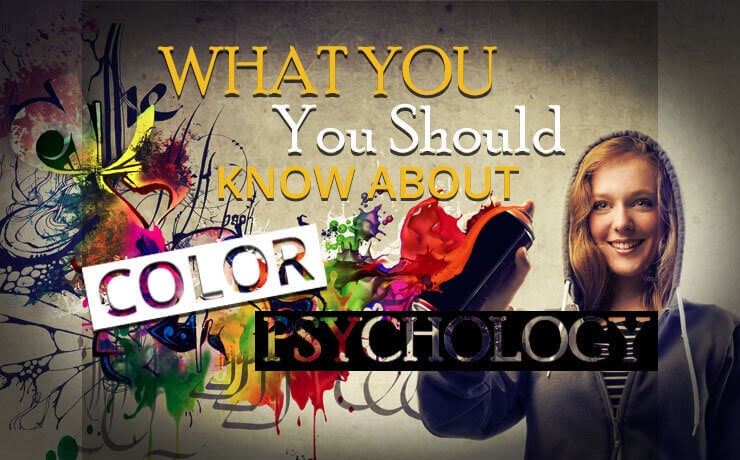
Color – a key player in the design world – is a very effective tool you can have at your disposal. By choosing the right colors, you can help your logo stand out from crowd and become an attention-grabber to pull in potential clients. What’s more, colors can be used to evoke an emotional response and convey a particular message.
If you are running a sports photography business, you should add colors like red into the logo because it is an “energetic” color. If you are a freelancer and have your own website, you can consider using colors such as green, yellow or orange. Most photographers usually know which colors they want to use, but if you are still unsure, you should do more research first. Take your time because you don’t want to end up communicating a wrong message due to poor color selection.
Sometimes, Less is More
While there is great importance with making sure that your logo appeals to your target audience and represents the nature of your website accurately, it is also important to keep it simple. This is a good way to ensure that your website logo is fully scalable and can be upsized or downsized without becoming an unrecognizable smudge. Simple logos are often easy to remember and will contribute to a positive branding experience. You don’t want to overwhelm your potential site visitors with too many design elements. When there is nothing left to remove from your design, this is an indication of a good logo.
Never Follow Design Trends Blindly
Staying updated with the latest design trends and mindlessly following it are two complete opposites. If you think that the latter is fine and you follow what other photography websites are doing, it is very difficult for your logo to stand out from the crowd. A good rule of thumb is to stay true to your brand’s nature and ensure that the logo accurately represents your business. In addition, “trendy” logos can go out of style very quickly and become outdated in a few months or less.
 Free
Consultation
Free
Consultation Free
Google Ads Audit
Free
Google Ads Audit