Ecommerce Web Design Trends – 10 Years of Overstock.com

Chad Faith
Director of Content

Overstock.com is an ecommerce site selling furniture and other items for the home that has been around now for over a decade. Rather than just making you feel old, this should hopefully demonstrate how a site of this nature can survive the ever-changing nature of the web. And how has Overstock remained such a big player for all this time?
By being adaptable.
As technology, trends and expectations have changed, so has the design and layout of Overstock. Adaptability is a hallmark of all highly successful ecommerce sites in fact and many of these sites have made the same changes to remain relevant and efficient as times have changed. Overstock serves as a nice microcosm of the larger world of ecommerce web design, so let’s take a look at how both Overstock and ecommerce sites in general have changed over the last ten years.
Width
One of the biggest changes that happened to Overstock.com occurred in 2010 when the site went from being a fixed 960px design, to a full-width layout. This change was largely intended to introduce adaptive design elements to the site so that it could be used on a range of devices.
Immersion
The increase in width is not just useful from an adaptive design standpoint though. At the same time, having a larger site also makes the experience more ‘immersive’, which is something we have begun to expect more and more from our technology. Gradually, many sites and organizations have begun pushing immersive layouts and the reduction of ‘chrome’ (the controls), which hopefully increases engagement and helps to better hold the attention of the visitors.
Minimalism
Along with this increase in width, you can also see immersion increasing through the reduction of ‘clutter’ on Overstock’s page. There are now fewer elements and fewer links. This means that the site can now feature more items for sale; increasing potential purchases, while at the same time making images bigger which will once again improve engagement. Instead of long lists of items with lots of categories, links and controls, you now have a page of large, attractive, touch-friendly images. Minimalism is generally popular in web design at the moment and is practical, thanks to the way it lends itself to adaptive design.
Flat Design
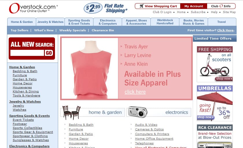
Head over to the internet WayBack Machine (which lets you see old versions of websites) to view a version of Overstock in 2004 and you’ll see that it uses a lot of icons that consist of small photographs of the items in question. These icons have a ‘3D’ feel, which was once all the rage in web design.
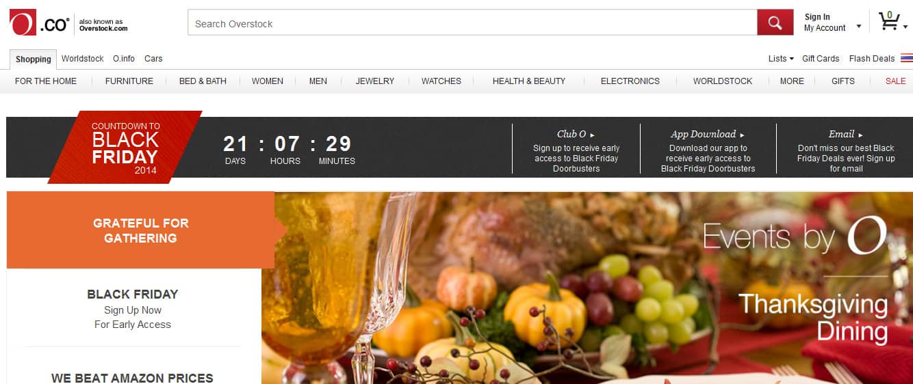
Today though, the site utilizes flat icons and banners with plain text. This is consistent with the trend towards minimalism popularized by new versions of iOS, which moved away from a more skeuomorphic angle. Here are some more inspirations.
Looking at the evolution of any website is a great way to see how web design in general is changing, which can in turn help you to stay one step ahead of the curve. Here are some more examples for further reading and if you need help with your ecommerce development, we at SmartSites will be happy to assist you.
 Free
Consultation
Free
Consultation Free
Google Ads Audit
Free
Google Ads Audit


