Color Schemes In Web Design: How To Choose The Right One

Chad Faith
Director of Content

Choosing your website’s color scheme may seem an easy task: you just pick two or three basic colors and you’re done. However, the website’s color scheme is one of the most significant factors for its success and you should account for many factors when making a choice.
In this post, you’ll learn the basics of color theory that you should adhere to when choosing the color scheme for your website, as well as modern color trends that let you launch a burgeoning website in 2017.
Three Pillars of Color Theory
When speaking about practical color theory, it’s impossible not to mention the notions that form its basis, such as complementation, contrast and vibrancy. Let’s see what these tree terms tell you about choosing the color scheme of your website:
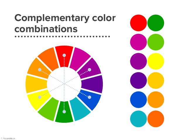
- Complementation is actually the way colors combine with each other. Every color has an array of meanings and a certain color combination puts this or that meaning of the colors to the foreground and has its unique feel. When choosing the color scheme for your website, you should account not only for the meanings of colors per se, but for the feel they disseminate in combinations.
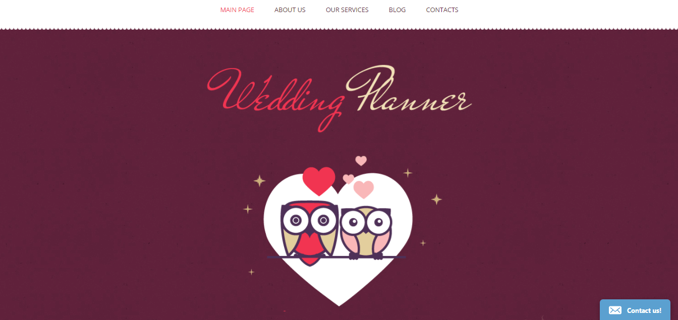
Let’s say, you want to go for red color for your website’s navigation and CTAs, as this is the color that stimulates users to go for deliberate action. If other colors that you use are white, rosy, cream or peach, your website will look like it has to do with romantic affairs (this color combination would do for dating agencies and wedding photographer websites). On the other hand, if you take darker shades of red and combine with dark shades of green, this combination stands for rich harvests and is frequently used for agricultural websites.
- Contrast is the degree to which a certain colored element differs from its environment. Contrast is important to account for, when choosing your website’s color scheme, as it provides for readability of your content and visibility of your CTAs.
When choosing your color scheme, go for colors that aren’t neighbors on the color wheel because analogous shades are contrast (read: readability) killers. The proven practice is to go for light background and dark-colored text. As an alternative, you may go for dim background and lighter and more vibrant text color.


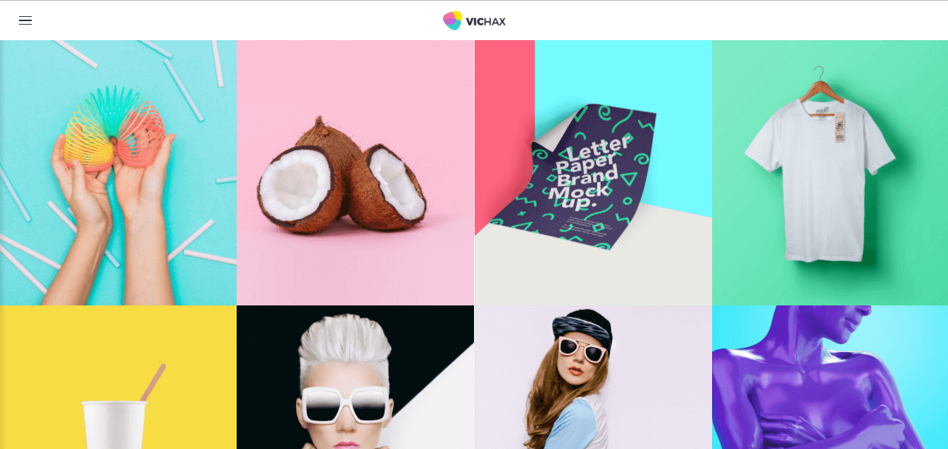
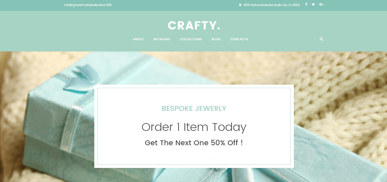
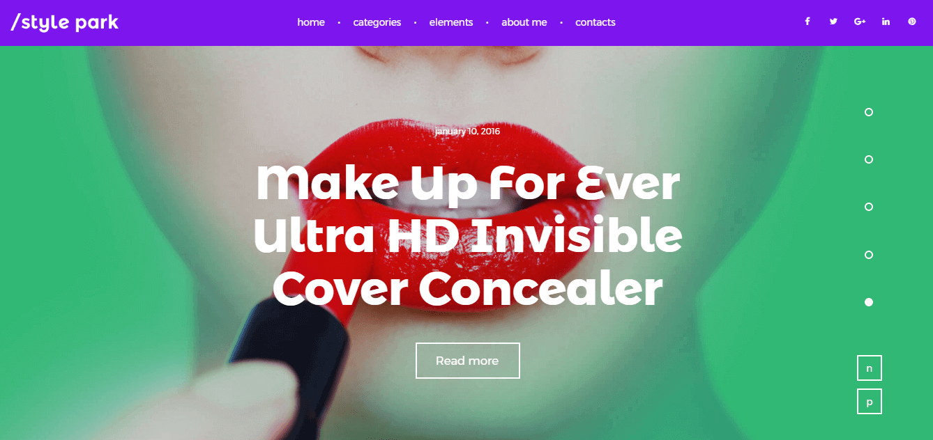
These two WordPress themes by TemplateMonster are a perfect illustration of the two types of color schemes mentioned above that ensure contrast and perfect content readability. Do not hesitate to go for one of such well-delivered high-contrast color combinations, to ensure that reading your website content is a pleasing experience void of disappointing eye-strain.
- Vibrancy is the brightness of the colors used for your website’s color scheme. Bright upbeat shades are proven to tune up website guests for positive interaction and guide their emotions in the needed direction. Moreover, they make your CTAs more noticeable and, consequently, result in higher conversion rate.
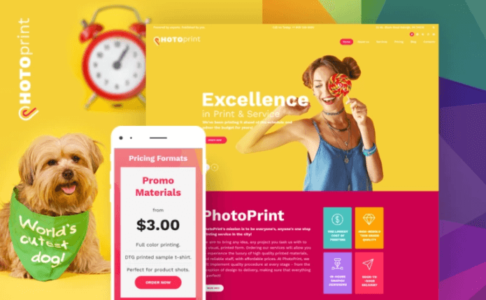
On the other hand, there are some cases when a subtle, unobtrusive color scheme helps to form the right atmosphere on the pages of your website. Use of a subtle color scheme may be expedient for a beauty and health services, spa or hotel website. See the example below that perfectly illustrates the importance of a link between the aim of the website and color choice.
Choose Your Right Color Scheme
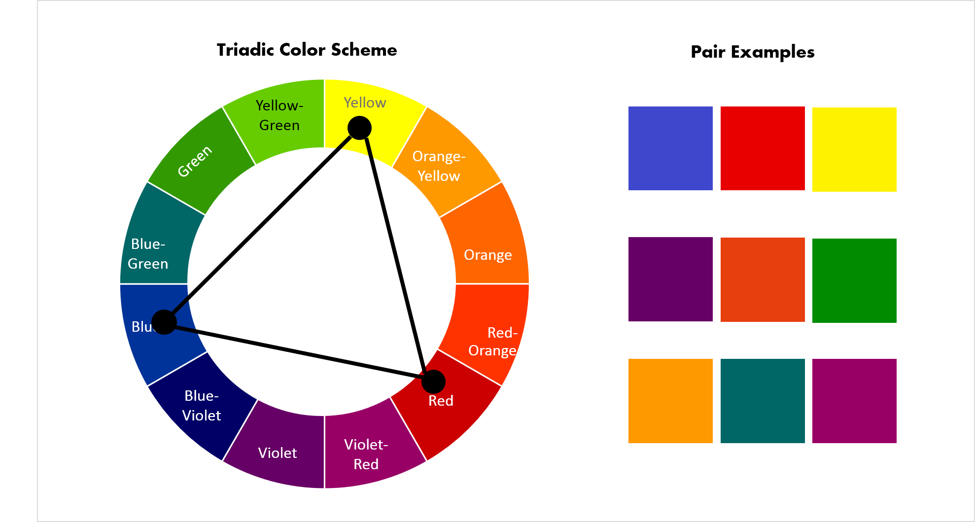
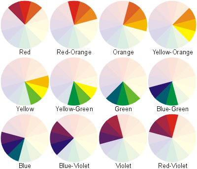
To choose a winning color scheme for your website, you can’t just choose colors randomly. There are three different approaches to choosing the basic colors for your website that would play well together. These three approaches are known under the names of as triadic, compound, and analogous color schemes. Let’s take out a color wheel and see their essence:
- Triadic color scheme consists of three colors, the one of which is typically a shade of blue, the second is a shade of yellow and the third one is a shade of red. Triadic colors reside on the summits of an equilateral triangle. These colors do not neighbor each other on the color wheel, thus, ensuring high contrast, and are equal in vibrancy.
- Compound color scheme makes use of colors that are situated one opposite the other on the color wheel. A typical compound color scheme consists of just two colors (which is frequently not enough for the purposes of website design). For this reason, web designers often go for a subtype of this color scheme referred to as tetradic. Tetradic color scheme consists of two pairs of complimentary colors and gives you more coloring options.
- Analogous color scheme makes use of the neighboring colors on the color wheel. With it, your website has a more subtle, delicate and harmonious feel. As the shades in the analogous color scheme are often the shades of the same primary color, they intensify its meaning and make it more pronounced.
These are the basics that you should understand to opt for a right color scheme for your website. However, I don’t tell you that you have to draw a color wheel and go for choosing color combinations on it. There are multiple handy color scheme generators available on the net so you can research on them. Canva has also done a handy Colors Design Wiki that you can use to understand more about colors, their meanings, and possible color combos.
2017 Trending Color Schemes
Frankly speaking, each year, use of color on the web undergoes certain changes, so it’s pretty much possible to determine the ‘age’ of the website after just looking at how it’s colored. If you’re striving to build a website that fully incarnates the gist of today, check out this section that exemplifies some of the latest trending color schemes.
Glowing Neon
Are you in search of something ultra-fashionable and modern? Do not be afraid to go for colors that glow from the inside. Neon color schemes are a perfect match of state-of-art fashion, beauty, cosmetics and photographer portfolio websites. The wisest choice is to go for a triadic color scheme of neon colors such as lime green, fuchsia and glowing blue that is underpinned by a monochrome black/white for ensuring content readability. Always keep in mind that neon accents should be used in moderation, otherwise you risk abusing the eyesight of your website guests.
Be Positive
Your website is not a canvas and there is no need to save paint. Bright, bubbly, upbeat colors positively influence the mood of your website guests and make them want to keep browsing your website. It’s also proven that positively-colored websites sell and convert more than neutrally colored ones. If you go for upbeat color palette in 2017 do not use primary colors as they are kind of trite. Go for matte shades or hues that are not so obvious.
Be Professional with White and Blue
If you want to introduce yourself as a true professional that knows all the pitfalls of the given trade, go for the tried-and-tested white-and-blue color scheme. With it, you can create clean and minimal websites that make uttermost emphasis on your website’s content and leave enough negative space to keep your website congruent. To further boost the effectiveness of your white-and-blue website, add a brighter shade to it (such as red, green or orange) that will bring your CTA buttons and important navigational elements to the fore.

Bottom Line
Color scheme choice is one of the most crucial ones that you make creating your website. If the shades used for your website clash, kill website content’s readability, or doesn’t match the aim of the website, you’re likely to be disappointed with your website’s high bounce rate. To hit the mark with your website’s color scheme, mind the basics of color theory, make friends with color wheel and keep in line with the trends that are rocking in 2017. I wish you to find your best-fitting color scheme and take your business up a notch this year!
 Free
Consultation
Free
Consultation Free
Google Ads Audit
Free
Google Ads Audit