
 Clutch
 G2
G2
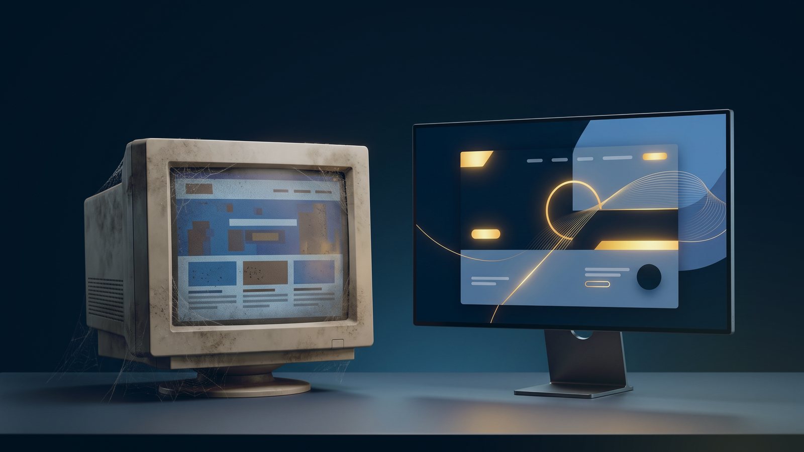
Want to take a stroll down memory lane and see the internet as it was in the late 1990s and early 2000s? One option is the Wayback Machine, which lets you view archived versions of old websites. Expect plenty of animated GIFs, auto-playing music, clashing color palettes and tiled backgrounds. And tons of Comic Sans. It is hilarious, if a little distressing.
You do not always need an archive to get a window into the past, though. Some corners of the web went untouched by progress or fashion for years, and they make perfect little time capsules. When we first wrote this post, a few famous examples were still online. Here is what they taught us, and what has happened to them since.
Space Jam: a 1996 site that proves how far design has come
The Space Jam site is often called one of the most pleasantly kitsch and retro websites on the web. It was built in 1996 and has been kept online, essentially unchanged, for decades. Like the old Geocities pages, it has a repeating starry background, a default Times New Roman font and a layout built from tables. The red text on a black background must have been a questionable choice even then.
It is a charming relic, and a useful reminder that every site eventually looks dated. The difference between this site and yours is that yours has to work for customers today.
You’ve Got Mail: a Flash intro nobody can use anymore
Another Warner Bros. site promoted the 1998 film You’ve Got Mail, starring Meg Ryan and Tom Hanks. The original greeted visitors with a hand-drawn-looking logo and a choice to watch the Flash introduction or skip it. Even back then, Flash caused compatibility problems. Adobe ended support for Flash at the end of 2020, and today’s browsers no longer run it, so intros like this are simply blank.
It was also an SEO mistake. A splash page with no real content gives search engines nothing to read, and gives visitors one more click before they get what they came for. The film’s page on the studio’s site has since been rebuilt in a modern format.

NSYNC: a famous brand with a forgotten website
This was a strange one, because the band stayed popular. For years, NSYNC.com went without a meaningful update, with default-looking fonts, dark blue text on a dark gray background and no links to any useful information. It is now a modern online store, which says something about how even famous brands eventually have to give in and redesign.
What these old sites teach us about your own
Next time you feel bad about your website, remember that sites like these were built by professional designers with big budgets. We have come a long way, and standards will keep moving. Today visitors expect a site that loads quickly, works well on a phone, is easy to read and clearly shows how to take the next step.
There are many more examples of sites that time forgot, from the Jurassic Park Lost World site to the Crash Bandicoot 3 site. Some are preserved in web archives, even where the originals have disappeared. What are your favorites?
“Our company has been working with SmartSites for quite some time now, and they have been amazing. Thanks to their expertise and dedication, we have reached many new milestones in a relatively short period of time.”
 Alexander LadighinCleaning master