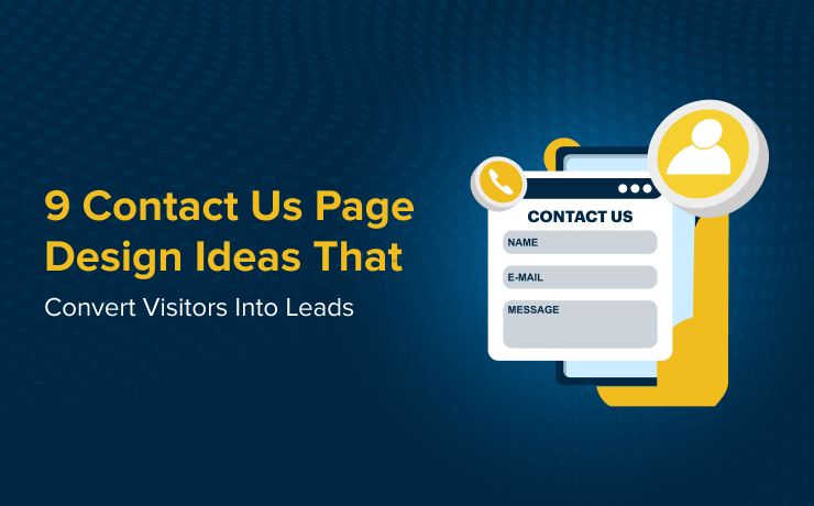
A great contact us page design does more than list an email address. It invites visitors to act, builds trust, and encourages them to share details confidently. The right design elements can transform casual site traffic into engaged leads. Here are practical contact us page ideas supported with examples to inspire your approach.
Keep It Simple and Direct
Clarity is the first rule in effective page design. Complicated menus and lengthy explanations push people away. A short introduction, key details, and an obvious action button often work best. For instance, some contact us page examples from startup sites showcase a minimal form with just name, email, and message fields, reducing hesitation to engage.
Use Clear Call-to-Action Buttons
Buttons should guide visitors to act without guesswork. Instead of vague text like “Submit,” use friendly and inviting wording such as “Let’s Talk” or “Start a Conversation.” These small tweaks matter. Well-placed CTAs are a common highlight in successful contact us page examples and help visitors move forward quickly.
Highlight Multiple Contact Options
Not everyone prefers the same way to reach out. Offering a choice between a quick form, email, phone number, or even live chat makes visitors feel supported. Many SaaS brands highlight two or three direct contact methods. These page ideas give users flexibility and increase the chance of capturing a lead.
Add Personality with Visual Elements
A big mistake is leaving the page bland. Adding brand colors, simple icons, or a friendly photo of your support team injects warmth. For instance, some pages use light illustrations or small graphics near form fields. It makes the page approachable and less intimidating.
Share Location and Business Hours
If you have a physical office, display your location and hours with clear formatting. Adding a small interactive map or a street view can strengthen credibility. Visitors appreciate knowing realistic times to reach you. This is one of the most practical contact us page ideas for local businesses aiming to build trust.
Reduce Friction with Smart Forms
Long, bulky forms discourage input. Stick to three or four fields and mark only the necessary ones. Progressive forms that expand based on answers are also effective in modern page design. These ideas reduce effort for the visitor while giving your team enough information to qualify leads.
Include a FAQ Section
Sometimes visitors have quick questions before reaching out. Adding a compact FAQ directly on the page can save time and reduce drop-offs. This feature is popular in many contact page examples from service companies. By placing answers to common questions right below the form, you capture both self-helpers and those ready to connect.
Showcase Social Proof
Adding short client testimonials or review snippets reassures potential leads that they are connecting with a trustworthy brand. Including one to three quotes along with star ratings or logos adds confidence. These design touches turn a simple contact page into a lead-converting asset.
End with Gratitude
A visitor clicking on your contact us page signals interest. A short thank-you message or an encouraging phrase like “We’re excited to hear from you” can leave a positive final impression. Subtle emotional touches are a key differentiator in strong contact pages.
Let’s Build Your Perfect Website
Your business deserves a website that attracts, engages, and converts. As a top-rated custom website design agency, SmartSites specializes in creating stunning sites that perform seamlessly across devices. Our award-winning team blends creativity with strategy to highlight your brand, improve user experience, and generate measurable results.
From fast loading speeds to SEO-focused design, we craft websites tailored to your goals. Ready to stand out online and win more customers? Partner with us today and take your digital presence to the next level.
 Free
Consultation
Free
Consultation Free
Google Ads Audit
Free
Google Ads Audit