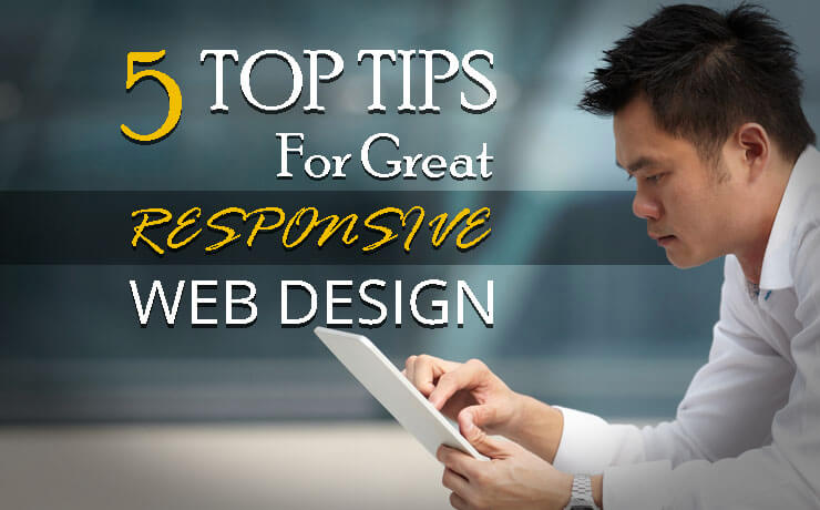
5 Top Tips for Great Responsive Web Design

Chad Faith
Director of Content
Responsive web design is web design that adapts to different sized displays across a wide range of devices from the desktop PC to the mobile smartphone. With so many different devices being used to view the web these days, having a ‘two sizes fit all’ approach just isn’t going to cut it anymore.
Responsive design allows you to maintain a consistent design across platforms, to adapt to numerous different displays on the fly (and even different sized browser windows) and to ‘future proof‘ your business against incoming changes to the web.
But while responsive design is a great option for the current landscape, it’s not a solution to all your problems in and of itself. Responsive design still needs to be approached with caution and it still needs to be done well. Web design done badly will be just as problematic as not using it in the first place.
With that in mind then, let’s look at some important tips that will help you to avoid common mistakes and design a site that’s conducive to resizing and scaling.
Stay Minimalistic
Minimalism is highly popular right now on the web but it’s all the more useful when you’re looking at adaptive design. That’s because having less on the page, means there are fewer elements to squish and move around when the dimensions suddenly shrink. Keep your page a little more sparsely populated and you’ll find it’s much easier to change shape and size on a whim.
Here’s a guide to applying minimalistic principles to your design.
Test, Test, Test…
And then test again!
Even if you think that you’ve created a design that works on every display ever built, that probably means you just haven’t tested on enough devices – there’s almost bound to be at least one screen size, resolution or aspect ratio that makes your site look broken so make sure to keep testing. Tools like ‘Screenfly‘ can be useful and help you to test this.
The best you can hope for is that you cover all of the most common sizes, resolutions and aspect ratios.
Reconsider Your Images and Typefaces
Just because something looks good in one size doesn’t mean it will work in another. Script typefaces, for instance, are falling out of favor at the moment as a result of more small-sized devices. They look great when they’re big, but they become hard to read when you shrink them down. The same can be true about some images, so make sure you choose them carefully and keep multiple sizes in mind when making all design decisions.
Use Max and Min
It’s important to set maximum and minimum sizes for all your images and other elements to prevent them from being stretched or compressed to extreme proportions. You don’t want someone to shrink their browser window and for your image to become a tiny dot on the screen – it’s a better practice just to force a little scrolling at this point.
Use Media Queries
Media queries allow your site to essentially find out what size it’s being viewed at and then to serve up the right content in response to that. No matter how hard you try to make your site flexible and dynamic, you will always find there is the occasional need to swap elements in and out as sizes change and this will allow you to do that.
Here’s a brief guide to using media queries, and then you’re well on your way to great adaptive design!
 Free
Consultation
Free
Consultation Free
Google Ads Audit
Free
Google Ads Audit


