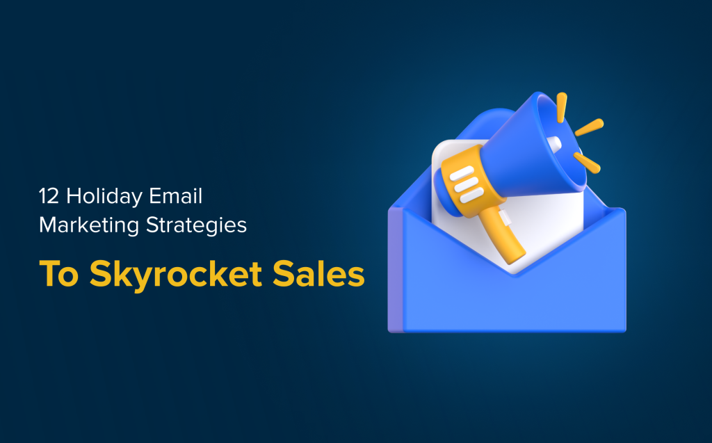
A strong email banner sets the tone before any text is read. It introduces your campaign’s message, draws attention, and reinforces brand identity. If designed well, it can influence the reader to keep scrolling instead of clicking away. The best email banner ideas mix visual impact with brand clarity. While many banners look good, only a few are crafted with purpose and performance in mind.
Use Timely Visuals for Seasonal Campaigns
Email banners that reflect seasons or holidays help connect your message to the moment. Whether it’s winter imagery, vibrant summer tones, or holiday accents, these visuals build an instant emotional connection that makes readers more likely to engage.
When paired with matching copy, seasonal visuals can support limited-time promotions or themed content. Over time, this approach can create a rhythm your audience comes to expect and look forward to. Keep designs focused and avoid overwhelming graphics to maintain clarity.
Create Urgency with a Countdown Banner
Adding a countdown timer to your email banner adds pressure in a way that words alone cannot. Visually displaying time running out motivates recipients to act quickly, ideal for flash sales, limited-time offers, or event deadlines.
Animated countdowns are easy to integrate and take up minimal space while naturally drawing the eye. When combined with a clear headline and focused call-to-action, they make time-sensitive campaigns more compelling.
Focus Attention on One Product or Service
Some of the best email banner ideas center around showcasing one item. A clean banner featuring one product image with a short, sharp description keeps your email direct and distraction-free. This allows your audience to quickly understand what you’re promoting and what action to take.
This format works especially well for new launches, product highlights, or service promotions. Pair it with one clear call-to-action so readers know exactly where to click.
Keep It Simple with a Clean Design
A minimal banner helps your message stand out by using fewer elements more effectively. Stick to one or two fonts, limited colors, and clear alignment for a polished look. This approach works especially well for service-based industries or professional communications.
Minimalist designs are easier to adapt for mobile screens and look clean across all email clients. They also load faster, which improves performance. A simple banner can make your brand appear confident and modern without extra decoration.
Add Motion with Lightweight Animation
A simple animation, like a flickering icon or shifting background, can make your banner more engaging. These visual elements catch the eye and help direct attention to your message. Used wisely, motion can add life without overwhelming the design.
GIF-based banners are commonly used for sales, product announcements, or to highlight multiple items in a limited space. The key is to keep animations subtle and fast-loading. When done correctly, animation adds energy to an otherwise static format.
Start With Better Strategy, Not Just Better Graphics
A well-designed banner is not just about appearance; it is about purpose. SmartSites helps you craft targeted messaging through expert E-mail and SMS marketing services that pair great design with smart strategy.
If you are ready to improve your email results, contact us to get started.
 Free
Consultation
Free
Consultation Free
Google Ads Audit
Free
Google Ads Audit