5 Awesome B2B Websites For Your Inspiration

Chad Faith
Director of Content

Learning from other web design experts is a stellar way to get inspiration for your own web design and development project. If you are planning to create B2B websites, you have come to the right place. Let’s get your brain juices flowing by checking out the following website designs:
Grammarly
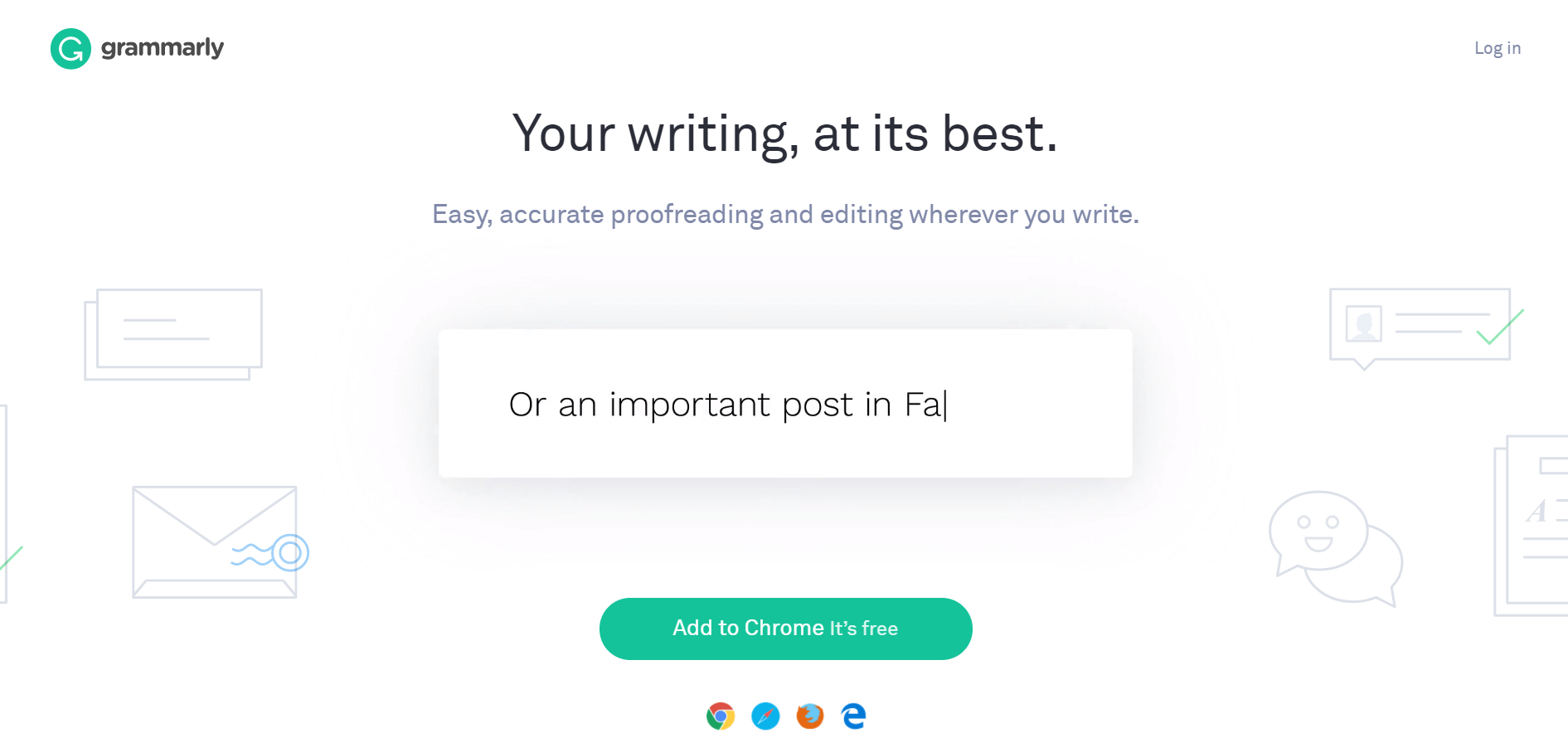
The winning point: Has a flat design.
Designers love Grammarly for a lot of reasons. Some of them include animations, functional minimalism, and long scrolling. However, the main reason is the implementation of flat design. The design fills up the entire screen without adding load to load time. This means that the site can load quickly on mobile devices as well.
Yapstone
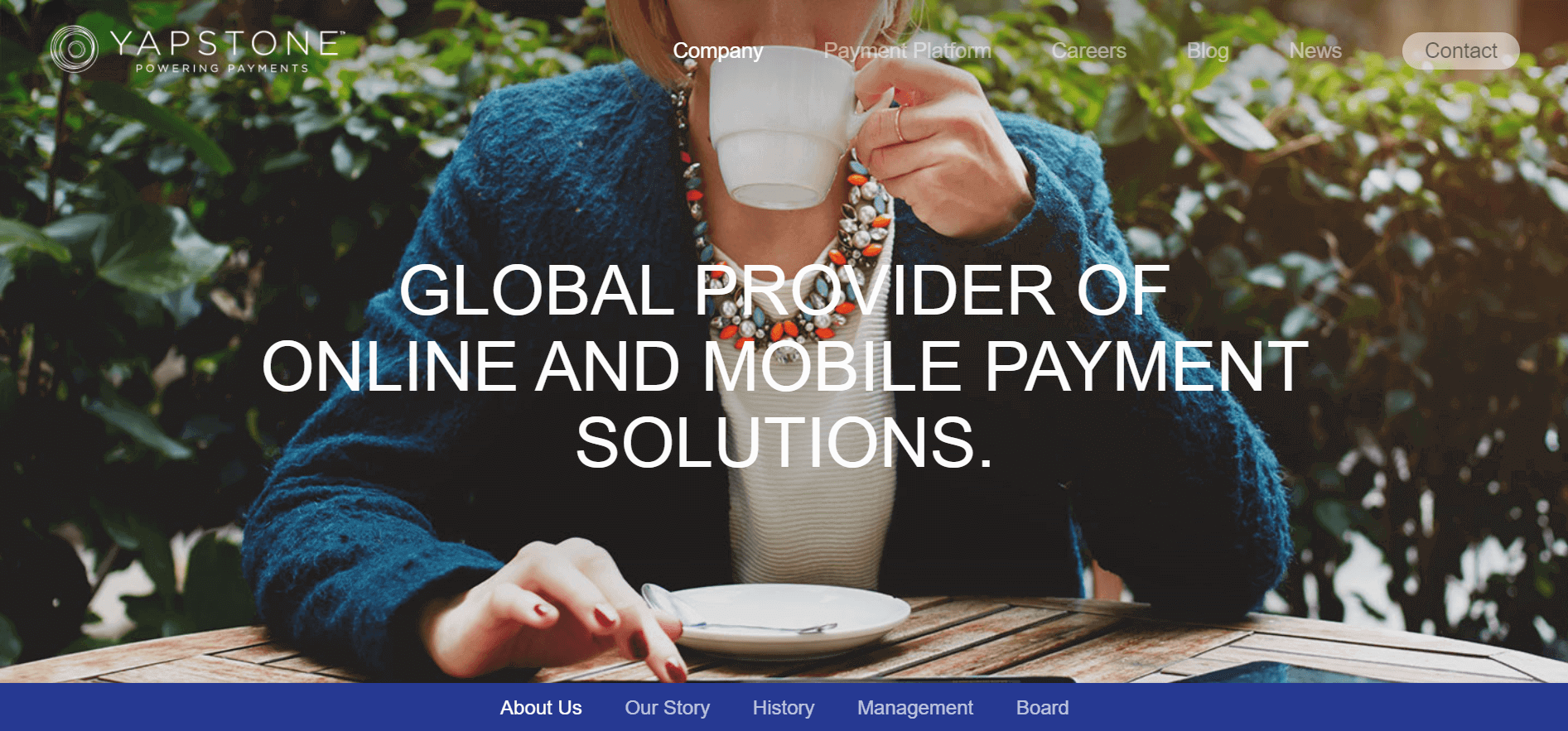
The winning point: Features a captivating range of photography
The cool things about Yapstone’s design is it being screen-sized and the use of beautiful photography. Do note that it was not just the content that attracted the eyes of web designers out there. It was how the site’s content and images were composed. A majority of visitors chose to stay on the site for a longer time because of the photography. As you can see, it truly is incredible what proper photography can do for both site conversions and visits. Be sure to check out their About Us page!
Dstillery
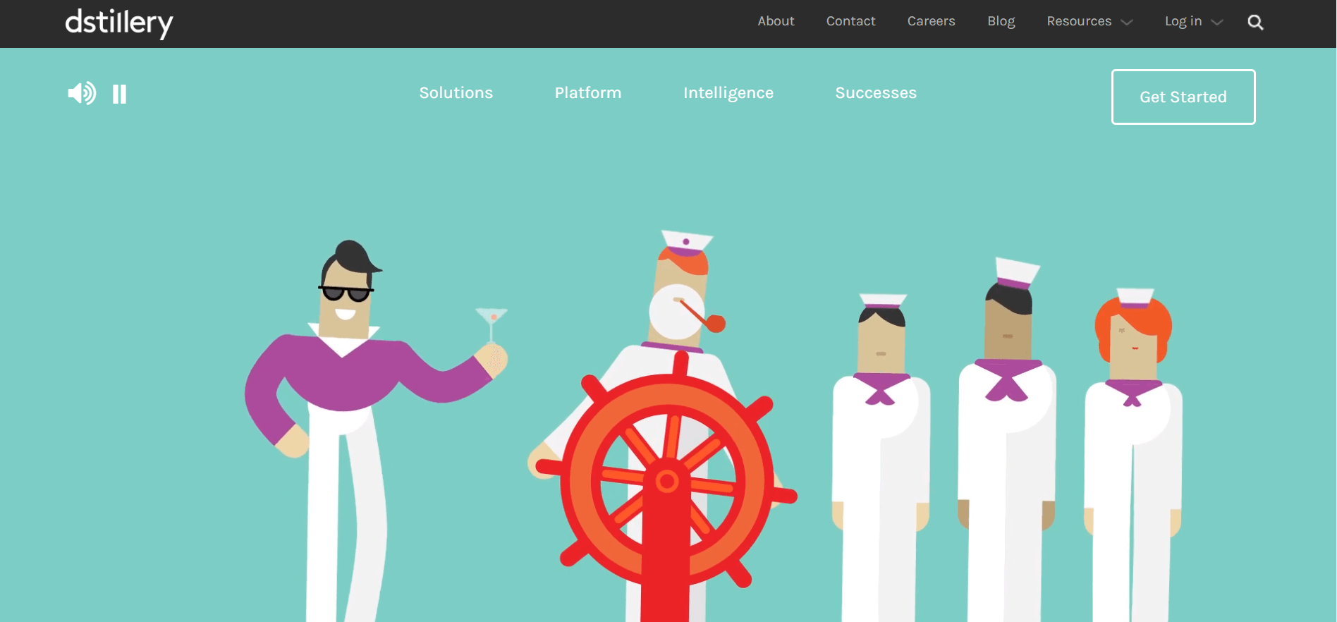
The winning point: Takes long scrolling to the next level.
Are users fine with scrolling? You can be sure that they do! Today, mobile usage is rapidly surpassing desktop usage. One of the most popular design trends today is long-scrolling pages. Long scrolling is designed to increase user experience on both mobile and desktop while giving your company or business a chance to tell a story. In Dstillery’s case, they took long scrolling to the next level with long, fixed scrolling. Their site features static elements while enabling main content to change (without moving the page) as one scrolls down. This is a fine example of revolutionary product marketing.
Pulse 220
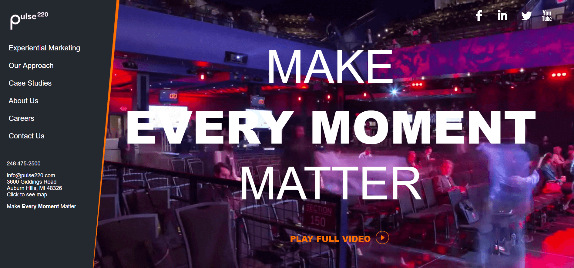
The winning point: Uses a card layout
It is important to present content in an organized, concise, and user-friendly way. Card layouts is a stellar way to achieve this and it is popularized by today’s mobile movement. As you can see on Pulse 220’s site, they utilized card layouts in more than one way: presenting both their team and their case studies. Modern web designers love card layouts because they are a precondition to displaying least information about what users are clicking into. If you are new to this, observe how Pulse 220 does it. You will be presented with generic but relevant information that makes it easier for you to determine if you truly wish to continue reading what the site has to offer, i.e. the role a person plays in Pulse 220 or topic tags for a case study.
Quid
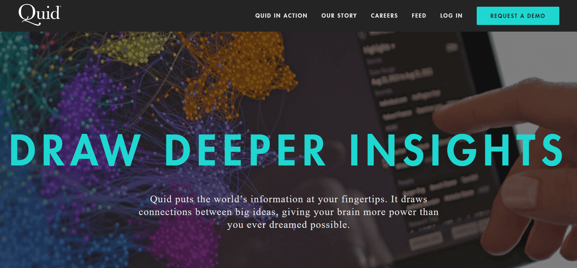
The winning point: Features functional minimalism at an optimal level
In recent years, minimalism was the main trend. The trend involved using only the essential on-page elements. If you are aiming to increase readability and decrease load time on your website, implementing a minimalist design is recommended. If you look at Quid, you will find that it is extremely easy to scan through the site and exit while having a clear understanding of their product. Not only does minimalist styles help UX, it also adds sophistication to your design. Another trait that Quid possesses is its clutter-free pages. Small bits of content are also made more captivating by increasing asymmetry and size.
 Free
Consultation
Free
Consultation Free
Google Ads Audit
Free
Google Ads Audit