10 Highly Effective Ways To Improve The Usability Of Your Website | Part Two

Chad Faith
Director of Content

Last time, we looked at five highly effective ways to start increasing the usability of your website. But when it comes to web design, the devil is very much in the details. In other words: we’re not done yet! Read on for five more pointers that can make your site go easier on the eye and become even more intuitive to navigate.
Speed Up Loading Time
Using the tips we’ve looked at so far, your visitors should be able to quickly find the information they’re looking for and read it easily. But if they then click that link and it takes too long to load then they’ll probably just leave. Either that, or they’ll repeatedly click the link and become highly frustrated.
Reportedly, visitors will often choose competing websites if they are even 250 milliseconds faster. Consider this a race, and make sure that your site wins!
Use Derivative Design
People spend a lot of time on the web these days and thus they have become used to certain commonalities between websites. By following this design language you can take advantage of their prior experience with websites and thus make your own site intuitive to use. That means that your logo should go at your top, your menus should be on the left or right of the page, your links should be blue and new articles should appear on the home page.
Of course you might sometimes want to diverge from these potentially restrictive constraints and which elements you decide to keep the same or alter will depend on the goals of your website. Nevertheless, these constants can be a useful starting point that help new visitors to find their way around your pages without having to re-orient.
Consider Employing Skeuomorphisms
A skeuomorphism is a design element that draws on our experience with items away from the computer to once again make a site or app more intuitive to navigate. This is why calendar apps tend to look like physical calendars, and why calculator apps tend to be laid out like real calculators. You can take advantage of skeuormorphisms in your web design and that way communicate with your visitors the function and operation of page elements with no need for written explanation.
Maintain Flow
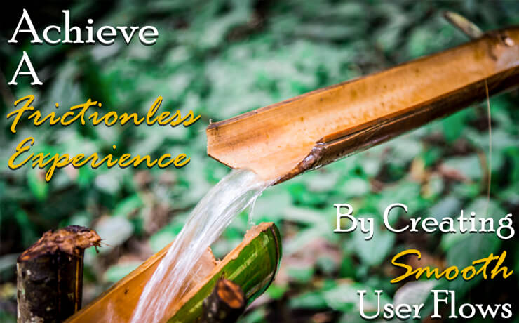
‘User Experience’ or ‘UX’ is a big buzz word in web development at the moment and refers to the way that viewers experience your design. Thus you should think not just about how they see your design statically, but also how they’ll move through your content and navigation elements.
Ideally you want to maintain a state of flow so that one page flows naturally and smoothly to the next. Any ‘break points’ could potentially mean they look elsewhere, so identify them and make sure there’s an easy next step there.
There’s a lot more to user experience than that, so it’s worth reading up on.
Test and Iterate!
And remember – web design is a constant work in progress! You can get feedback on usability from testers and focus groups, from statistics, from case studies and from feedback from users. Keep tweaking your design and you will be able to improve usability in respond to your viewers’ needs and ever-changing expectations.
 Free
Consultation
 Free
Google Ads Audit


